When I started my business, I came up with the name “ODonnell Collective”. O’Donnell is my last name, and the word “Collective” to me shows that all my work is a collection representing my name and how proud I should be of it. My original logo was a very crappy cursive lettering of “ODC”, with a weird beige color. I wanted to rebrand myself and show how professional I truly am, and I feel the beige didn’t show that. I did a poll on my instagram, and one of the recommendations, was to do a more luxury design. So I tried a couple different designs.

I ended up with this as my final design. A very sleek and luxury font for the O and C, with a golden overlay to give it style and fit with the luxury font. I put it all on a deep and dark blue banner, as the blue makes the gold pop significantly.
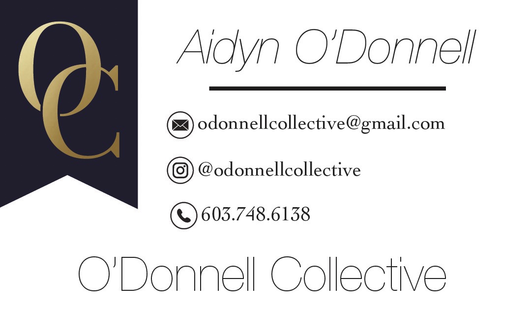
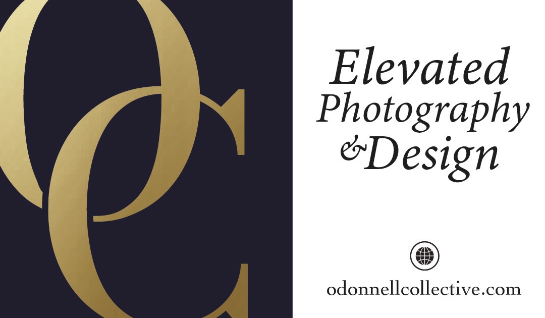
Next I wanted to design a proper business card that I can give to people so they can understand how serious I am, and I came up with this design. I wanted to do something a little different than most cards, and have useful information on both sides, oppose to having one big logo on one side, and all the information on the other.
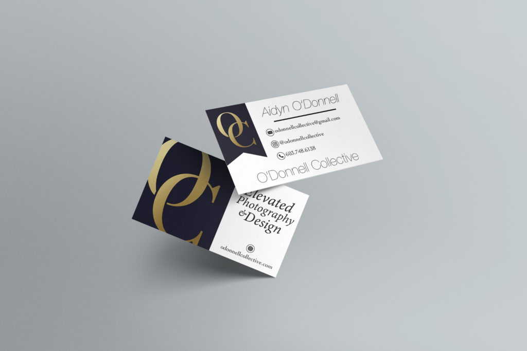
This rebrand ended up doing wonders for me and my brand. It has brought in so many different clientele, and has gotten very good feedback from people on how good it looks. This new logo, shows new clients how serious I take my work, and how good the quality will be. I believe this will forever be my logo for my business.